The Salvation Army
A campaign built around compassion
Context
The Salvation Army’s red shield is one of the most recognisable symbols in the world. It carries deep meaning and history, yet strict brand guidelines prevent it from being adapted, dismantled or used as a graphic device.
The challenge was to create a campaign that expressed the spirit of the organisation while respecting those boundaries.
How could the meaning of the shield be communicated without ever showing it?
The idea
The idea emerged from a simple question.
If the shield cannot be used, what does it represent?
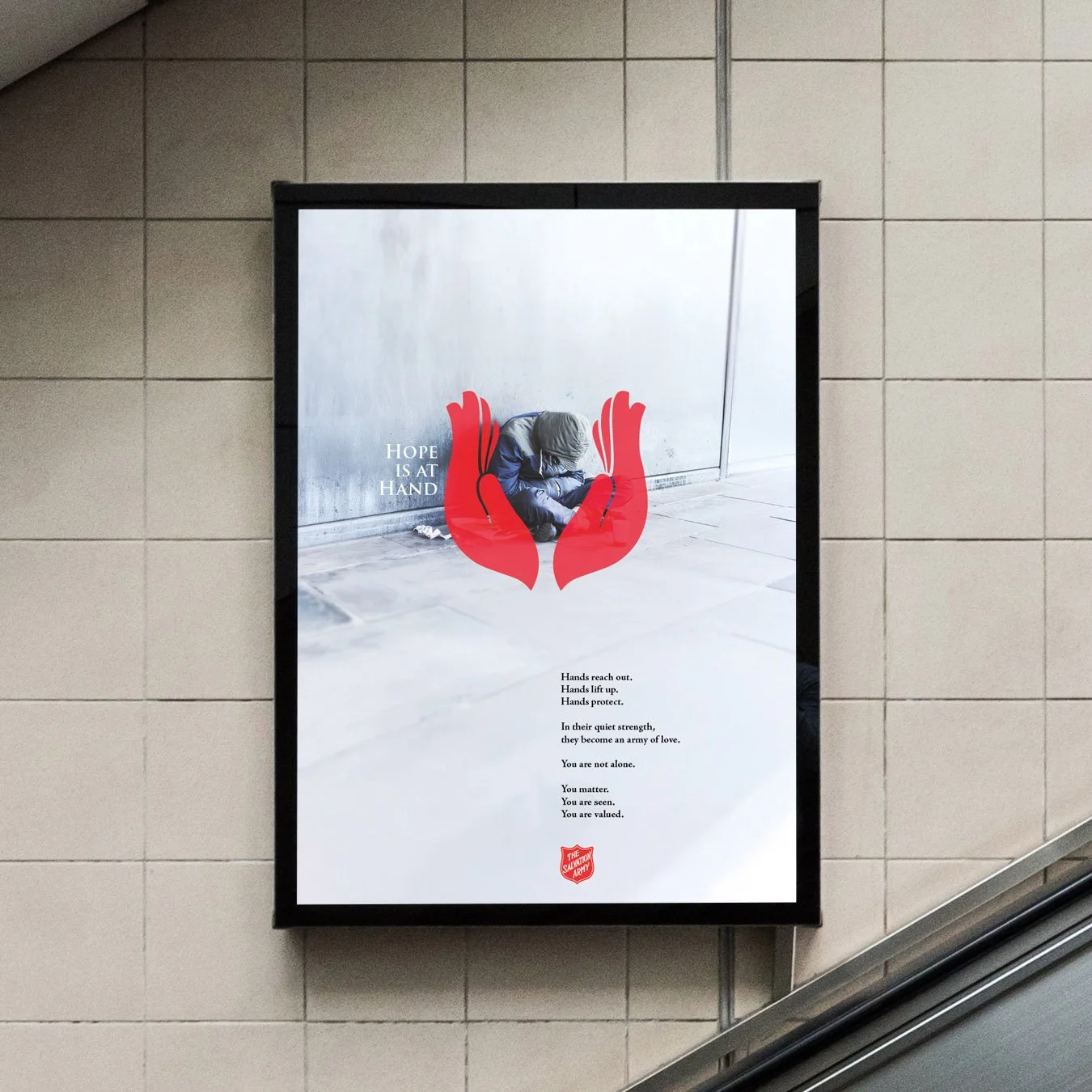
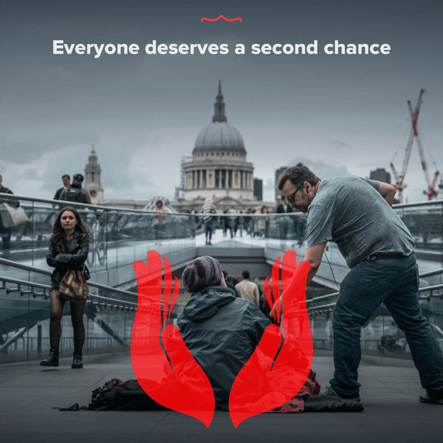
Looking closely at the geometry of the shield suggested another form: hands raised in prayer.
Stylised and symmetrical, the hands echoed the protective geometry of the shield while introducing their own emotional language of shelter, care and support.
As the concept developed, another reading appeared. The same form could also be seen as wings.
The image now carried several meanings at once.
A shield.
Hands in prayer.
Wings of protection.
Not a reproduction of the brand symbol, but a reflection of what it stands for.
The outcome
The hands became the central motif across posters and social media.
In print, they cradled real people, expressing compassion and support.
Across social posts, the hands opened frame by frame to reveal short messages capturing the spirit of the organisation’s work.
The campaign created a visual language that respected brand restrictions while extending the emotional presence of the shield.
What this reveals
The Salvation Army is more than a symbol.
It is a movement of compassion in action. One that shelters, lifts and protects.
A gesture.
A shield.
A set of wings.